
Why Are People Leaving Your Website?
 It’s a hard enough task to think up a business idea and build a website. It’s another thing entirely to make it attractive and interesting enough to keep up interest from your visitors. If you’re wondering why you have a high bounce rate on your site or specific pages, it might be time to take a look at your design. Is the navigation faulty? Do you have too many ads? Do you have annoying pop up videos or sign-up mailing lists? We have a few ideas for you to improve your website design and some examples of what not to do.
Bad Navigation
It can be pretty frustrating to go to a website only to discover poor navigation. Inconsistencies in the navigation cause users to feel confused or annoyed - feelings you don’t want them to express when viewing your site. When setting up your navigation, there are a couple of things to avoid. First off, don’t use visual elements that aren’t clear in telling where the user is and what they are supposed to do. Second, don’t scatter your main navigation links around your homepage. And don’t put them in the actual body text. They should be in a logical position up top and easy to locate. Your navigation buttons should follow a logical pattern and be easy to understand. They should be grouped together in a central area and if you have a really large website, it’s always a good idea to have a sitemap.
Ads Everywhere
Quite a few websites have pop up ads to showcase a product or get you to buy a similar product/service. Try and avoid this at all costs. Suffocating your site with ads will turn most users away. Right off the bat, it should be common knowledge that ads should not be the first thing your visitors see. And please don’t cover up your content with a pop-up ad. Visitors come to your website to read your content and get information, not to be delayed with annoying ads that they can’t close. Also, don’t put ads on your website that take up more space than your content. This isn’t to say that you can’t have ads on your website. It can be done tastefully and discreetly. Remember, your main goal is to highlight what your business is and showcase all of your useful content. Ads should come in second place and have a minimizing effect on your users.
Poor Content Structure
Content is perhaps the biggest offender in turning people away. If you have poor content structure and users cannot find what they are looking for, they’ll go elsewhere. If you have content that can be communicated in one page, do so. Don’t feel the need to spread it across several pages. You want to make it easy for people to find what they are searching for. And don’t forget to include introductory content. What is the purpose of your business? What do you want to communicate to your audience? That should be first and foremost on your homepage. When formatting you website, group similar content in a clear and concise manner. Use bold headings and highlight specific keywords that visitors may be searching for.
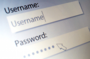
Forcing Users to Register
Forcing users to register to view your website is a physical barrier that should be avoided if at all possible. Ultimately, users will go elsewhere to find the content they are looking for instead of signing up for your website. Most people are hesitant to give out their personal information. You definitely do not want to have excessive pop-ups on your site requiring visitors to register before viewing the information on your site. If you have a site that does require registration, perhaps you can give them a short preview or a demo of your site first. It’s important to avoid putting up any barriers that will cost you visitors and conversion rates.
Poor Font Choices
Hard to read fonts, bright colors, and typos are all contributors to a poor user experience. It’s important to choose typefaces that are easy to read. It’s tempting to use several elaborate fonts to increase the attractiveness of your site, but it’s more off putting than anything. For most websites, bright, abrasive colors are unnecessary and distracting. It’s a good idea to hire a designer up front when creating a website. They will know the color palettes and fonts to use in order to make your website pleasing for visitors.
Lack of Updates
After all you hard work, you have finally created a beautiful website that has easy to use navigation, great font and color choices, and a nice selection of content. But don’t stop there! You need to keep content updated continually for a fresh website. If you can, avoid having “under construction” phrases on your site for long periods of time. People will take this to mean that your site is out of date and they will move along. Keeping your content fresh and up to date will boost interest levels in your site, but it will also help with search engine rankings. If you’re at a loss of what to do, a blog is a great way to keep current with new content.