
Do I Go Mobile or Responsive?
It’s a mobile world. There, we said it. The importance of having a mobile-friendly website is more necessary than it ever was. It used to be that Google favored responsive sites, but with the recent mobile update, having a separate mobile website is also acceptable. But which one is right for you?
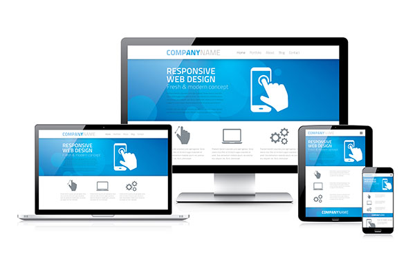
Let’s take a look at the major differences between responsive and mdot sites. An dedicated mobile site is built specifically for mobile devices and lives on a separate subdomain. A responsive site is a bit more encompassing as it is a single website that will work with any mobile device or computer. Responsive designs are quite popular because it will adapt content to fit any screen size. With these definitions in mind, let’s take a look at the pros and cons of each.
Pros and Cons of Responsive Sites
We’ve already talked about one major pro - the fact that responsive designs will adapt to the screen size. So the videos, content, graphics, etc. that you can view large as life on a computer will automatically be readjusted to read on your smaller device with just as much ease. Responsive designs are generally easy to maintain and work pretty well across multiple devices. For marketing purposes, responsive has another ball in its corner. When marketing your brand, you only have to maintain and update one website instead of remembering to market your brand across two websites.
Responsive sites are great, don’t get us wrong, but there are a few downsides as well to consider. Since responsive sites need to be able to load images for all devices, load times can be a bit slower. These sites have also been known to have some targeting issues. If, for example, you are using an iPhone and you are being shown Android apps, you can’t download or use the information. This can be a frustrating user experience.
Pros and Cons of Dedicated Mobile Sites
Having a separate mobile site has its advantages. It corrects many of the problems you could potentially run into with a responsive design, especially the targeting issue. With a mobile site, if you only want to target iPhone apps to iPhone users, it can be done within these formats. Dedicated mobile sites load device specific images, so load times can be slow due to the need for redirects.
When considering the pros and cons, you also need to factor in cost. The cost of website development depends on the complexity of the design and functionality. No matter whether you are choosing responsive or dedicated mobile site, there are several factors to consider:
- map out how you want to create your website and what is important for it
- developing the design
- testing and more testing to make sure the design works
- test on multiple devices to make sure it works
It’s easy to get wrapped up in the actual design and how it will function for users, but don’t forget about maintenance. The website is your responsibility and you need to consider how much time you are willing to put in. With an dedicated mobile site, you need to manage two different sites. Responsive designs only requite managing one site, but that doesn’t mean it’s better or even cheaper to go responsive. No matter which option you choose, it’s going to take time and money.
Bottom line, there are advantages to both responsive and dedicated mobile sites, but you have to decide what is going to work best for you. If you’re not really sold on having to make big changes to your website, having a separate mobile site might work better for you. If you are ready for a site upgrade and major changes, heading down the responsive direction might be best. Carefully weigh your options and choose what is going to create the best user experience for your customers.