
The Benefits of Responsive Design
Responsive web design is becoming a popular choice in today’s online market. It provides a cross-device experience that both users and search engines seem to prefer. If you’ve been thinking about what kind of design you prefer for your website, check out the following information to get a quick rundown on what responsive design is and what the benefits are.
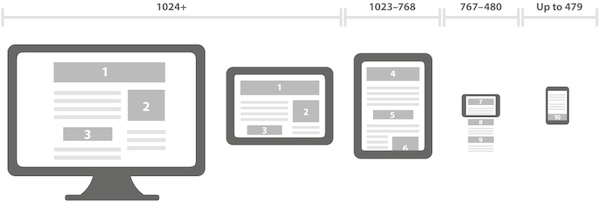
First of all, you may be wondering what exactly is a responsive design. It’s pretty simple actually - the goal is to detect the user’s screen size and orientation, whether it be a desktop, mobile phone, tablet, or other device. What this means is that your content adapts to the screen it’s on without sacrificing functionality and aesthetics. This is particularly helpful if you are viewing a website on a smaller screen because you don’t have to scroll left and right to make all the information fit on the page, it’s already done for you.
In this day and age, many people rely on their phones to get information. This is why it is so important for your website to be compatible for mobile design. Having a mobile website does not necessarily equal responsive design. There are definite differences between the two when you are considering which option to go with.
Mobile Website Design
- The content and look of a mobile site are different than the desktop version. Usually the mobile site only contains a fraction of the full website and content.
- Mobile sites have a different URL than the main website.
- Mobile sites tend to be beneficial for websites that have a lot of pages and information needs to be condensed.
- Load times are generally faster because there is less information being accessed.
Responsive Website Design
- Only one URL is used for both mobile and desktop, so nothing has to be changed from one to another.
- HTML code can easily be repurposed.
- Since the site is the same across the board, you can access analytics from one place instead of multiple spots.
- Not quite as beneficial for larger websites with a lot of pages. The user may have to scroll longer to find the content they are looking for.
Responsive design has many benefits. First off, if a user likes the look and aesthetics, they are more likely to return to your site. Generally speaking, load time is very quick (unless you have hundreds of pages of content) and information is the same from one device to the next. With regards to search engine optimization, it is easier for Google to crawl and index one website, instead of two different URL’s, which is what would happen with a traditional/mobile combo. Also one website means one SEO campaign. If you have a traditional site and a mobile site, you are looking at two SEO campaigns, which means you have to keep track of more information and possibly spend more money.
Responsive web design is definitely something to think about and will provide a great option for viewing your website across multiple devices without the hassle of trying to fit content onto a particular screen size. Most consumers prefer a mobile-friendly site and with all of the technical gadgets coming out, it’s worth considering converting or designing your site around a responsive design.